Late in 2013, many states adopted a “transitional policy” allowing people with individual or small group insurance before the Patient Protection and Affordable Care Act (ACA) single risk pool requirement became effective in 2014, to keep their current insurance.1 We reviewed individual ACA market experience and risk corridor transfers by Qualified Health Plan (QHP) issuer in each state to determine if there was a correlation between the transitional policy and issuers’ 2014 individual market ACA medical loss ratios. Our analysis indicates that issuers in states that implemented the transitional policy generally have higher medical loss ratios in the individual ACA market.
While high medical loss ratios may be due to multiple reasons, the correlation we found with transitional policy states is not surprising. However, this analysis begins to quantify the impact to some degree. Based on our work with ACA issuers across the country, we know that issuers often attempted to price ACA plans to the average statewide morbidity assumed in the marketplace. In the individual market, transitional plan members are generally expected to be healthier than ACA members because transitional members likely passed some form of underwriting at time of issue, whereas ACA members purchase their insurance in a guaranteed issue environment. Issuers priced the 2014 ACA premium rates assuming the statewide morbidity level would include the generally healthier transitional policies. Because the transitional policy was created long after issuers filed their 2014 premium rates, the statewide morbidity level without the transitional policies was higher than issuers generally assumed, resulting in 2014 premium rates being generally underpriced.
Impact of transitional policies on 2014 ACA experience
We reviewed 2014 individual ACA experience by the transitional percentage provided in an April 17, 2015, letter from the Centers for Medicare and Medicaid Services (CMS) titled, “Transitional Adjustment for 2014 Risk Corridors Program,” which CMS used to adjust its 2014 risk corridor estimates. We grouped five states allowing transitional enrollment with non-transitional states in our analysis. CMS indicated these states have 0% transitional enrollment percentage.
Some states allowed early renewals, where insurers could move non-grandfathered policies to a December 2013 effective date and keep the policies out of the 2014 ACA single risk pool. CMS did not consider early renewal policies to be “transitional” because issuers needed to consider early renewals in their 2014 pricing. However, early renewals will become transitional policies in 2015.
We only reviewed the experience of QHP issuers. These are issuers with at least one exchange plan and whose ACA experience is found in the medical loss ratio (MLR) reports.
The table in Figure 1 displays the 2014 QHP issuer individual market ACA experience by state, based on the CMS transitional percentage.
Figure 1: 2014 Individual ACA Experience by State for QHP Issuers by CMS’s Transitional % of 2014 Individual Market for Each State
| CMS Transitional % | States 2 | QHP % of Total | Earned Premium PMPM | Loss Ratio 3 | Loss Ratio After Reinsurance | Unadjusted Net Risk Corridor Transfers as % of QHP Premium |
| 0%-Transitional | 18 | 92% | $344 | 94% | 75% | 1% |
| 1%-20% | 24 | 95% | 340 | 111% | 87% | 9% |
| 21%+ | 9 | 94% | 334 | 126% | 99% | 17% |
| Total | 51 | 93% | $341 | 106% | 84% | 7% |
Appendix A provides the Figure 1 information on a statewide basis. The percentage of transitional policy members in a market appears to be correlated with higher individual market loss ratios. Risk corridor transfer amount as a percentage of QHP premium is another measure of issuer performance. Risk corridor transfers are the QHP profits or losses an issuer shares with the federal government. The higher the loss ratio, the higher the unadjusted risk corridor net transfers to issuers. Figure 1 shows a consistent pattern of higher unadjusted risk corridor net transfers to issuers as a percentage of QHP premium similar to the loss ratios.
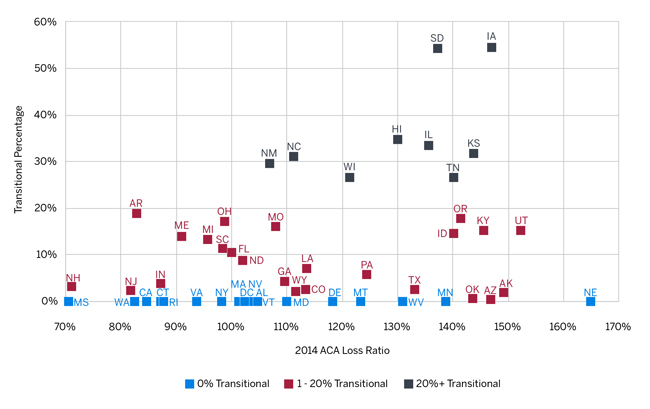
The graph in Figure 2 shows the 2014 ACA loss ratio versus the transitional percentage for each state. Less than a quarter of the states in the 0% transitional category (4 of 18) have statewide QHP-issuer loss ratios above 120%, while nearly half of states in the transitional categories (16 of 33) have statewide QHP-issuer loss ratios above 120%. We calculated a 0.26 weighted regression R-squared value indicating a significant relationship between the three transitional state categories’ and their 2014 loss ratios.
Figure 2: 2014 ACA Loss Ratio vs. Transitional Percentage for QHP Issuers
Potential impact on 2017 rate increases
As multiple states have reported, preliminary 2017 rate requests are often coming in higher than historical ACA rate increases.4 We compared the 2014 individual ACA loss ratio with the 2014 to 2016 base premium rate change for each QHP issuer on the exchange in both 2014 and 2016. We defined an issuer’s base rate change as the 2014 to 2016 change in the issuer’s average statewide lowest silver-tier exchange age-21 premium rate. We developed these premium rate changes by weighting the issuer’s lowest exchange silver-tier plan base rate for each rating area by the portion of statewide 2014 ACA enrollment in that rating area among all issuers. For state-based exchanges where ACA enrollment by rating area was not available, we weighted the issuer’s lowest exchange silver-tier plan base rate for each rating area by the portion of the state’s under age 65 population in that rating area.
The table in Figure 3 shows that issuers in transitional states had higher 2014 loss ratios but appear to not have taken large enough 2015 and 2016 rate increases to achieve profitable 2016 loss ratios (assuming 2014 to 2016 significant cost savings are not realized in other ways). Although issuers’ 2017 rate increases will reflect their 2015 experience and updated projections, there is potential for transitional states to see higher rate increases in 2017.
Figure 3:5 2014 Individual ACA Experience by State for QHP Issuers in Both 2014 and 2016 Exchange
| CMS Transitional % | States | % of Total Market | 2014 Loss Ratio6 | 2014 to 2016 Rate Change | Projected 2016 Loss Ratio7 |
| 0% Transitional | 18 | 70% | 89% | 12% | 87% |
| 1%-20% | 24 | 85% | 109% | 17% | 103% |
| 21%+ | 9 | 82% | 125% | 33% | 104% |
| Total | 51 | 79% | 104% | 17% | 98% |
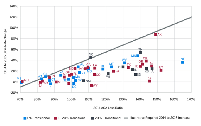
The graph in Figure 4 shows the 2014 ACA loss ratio and the average 2014 to 2016 statewide QHP base rate change for each state. The gray line represents an illustrative 2014 to 2016 rate increase needed to target an 85% 2016 loss ratio given the 2014 loss ratio and assuming a 5% annual claim trend. For example, a state with an 85% 2014 loss ratio would require a 10.25% 2014 to 2016 rate increase to target an 85% 2016 loss ratio (i.e., 5% annual rate increases to cover the 5% annual claim trend to maintain the 85% loss ratio). States well underneath the line indicate a possible need for higher 2017 increases than states closer to the line. Keep in mind that projected 2016 loss ratios are merely illustrative. There are many factors that will affect a state’s overall 2016 loss ratio and required 2016 and 2017 rate increases, such as, but not limited to, changes in experience and statewide morbidity levels, wear-off of pent-up demand, provider contracting, claim trends, population migration and characteristics, and product and issuer mix. These values also represent a statewide composite, while specific issuers could have materially different results than the average.
Figure 4: 2014 ACA Loss Ratio vs. 2014 to 2016 Base Rate Change for QHP Issuers in FFE States
Impact of the transitional adjustment percentage
Using QHP issuer data reported in MLR forms, we replicated the CMS risk corridor calculation, incorporating the transitional adjustment specified by CMS and updated reinsurance/risk adjustment totals. The table in Figure 5 outlines the results of this recalculation.
Figure 5: 2014 Risk Corridors Payments and Receipts by Market Type (with transitional adjustment)
| Unadjusted Payment | Prorated Payment* | |||
| From Issuers | To Issuers | From Issuers | To Issuers | |
| Individual | $342M | $(2,535M) | $342M | $(318M) |
| Small Group | 19M | (319M) | 19M | (40M) |
| Merged | 2M | (35M) | 2M | (4M) |
| Total | $362M | $(2,889M) | $362M | $(362M) |
| *Calculated payments to issuers prorated to maintain revenue neutrality | ||||
Note that while issuers that experienced better-than-expected results paid into the program roughly $362 million, issuers with adverse experience expected $2,889 million from the program, resulting in a net $2.5 billion payment owed to issuers under the risk corridors program. However, the regulatory requirement that only funds paid into the risk corridors program be used to pay out required payments to issuers is to be prorated at a 12.5% rate.8 One item of interest here is that the individual market is a net payer for prorated risk corridor payments, contributing $342 million while only receiving $318 million.
The table in Figure 6 illustrates how net risk corridor payments are distributed by transitional membership. Issuers in transitional states requested significantly higher amounts from the program, and after proration, 0% transitional states contributed $193 million more to the risk corridor program than they received from it. This suggests QHP issuers in 0% transitional states were more likely to reflect the underlying morbidity of the populations enrolled in their plans. Even after proration, transitional state issuers still received money from the risk corridors program, although the net impact was certainly decreased.
Figure 6: 2014 Risk Corridors Net Payments by Transitional Market Type
| Full Payment | Prorated Payments | |||
| Total | % of Premium | Total | % of Premium | |
| 0% Transitional | $(138M) | -1% | $193M | 1% |
| 1%-20% | (1,434M) | -9% | (95M) | -1% |
| 21%+ | (649M) | -17% | (77M) | -2% |
| Total | $(2,220M) | -7% | $21M | 0% |
The table in Figure 7 outlines individual market loss ratios for non-ACA business as well as for ACA business net of risk adjustment and reinsurance without risk corridors (RC), with full payment of risk corridors, and reflecting the prorated risk corridor amounts for QHP issuers. This table reveals several interesting observations:
- For QHP issuers, non-ACA business in states that did not implement the transitional policy was not particularly profitable.9
- If risk corridors had been fully funded, ACA loss ratios in transitional states would have been similar to non-ACA loss ratios, suggesting the transitional adjustment would have largely compensated issuers for costs.
- Revenue neutrality considerations largely negate the impact of the transitional adjustment, leaving issuers in transitional states with significantly larger 2014 losses. While 2014 risk corridor requests have first priority on any additional funds available to the risk corridors program, it is still not known if and when issuers will receive further risk corridor transfers.
Figure 7: 2014 Risk Corridors Adjusted Loss Ratios by Market Type (with transitional adjustment)
| CMS Transitional % | States | Non-ACA Loss Ratio | ACA Loss Ratio | ||
| No RC | Full RC | Prorated RC | |||
| 0% Transitional | 18 | 97% | 75% | 74% | 77% |
| 1%-20% | 24 | 81% | 87% | 78% | 87% |
| 21%+ | 9 | 87% | 99% | 83% | 97% |
| Total | 51 | 85% | 84% | 77% | 84% |
While it is interesting that the transitional adjustment was largely effective given full risk corridor transfers, the reality of risk corridor budget neutrality means that issuers in transitional states incurred significant losses. The losses incurred by issuers in transitional states may cause issuers to be more conservative in future rate filings, given the continued unknowns in this young market and the sunsetting of the federal reinsurance and risk corridor programs.
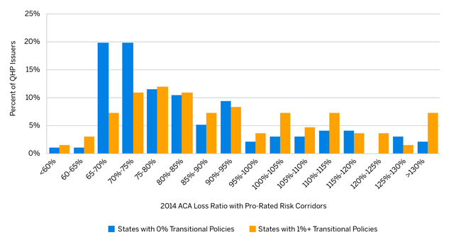
Figure 8 provides a distribution of QHP issuers by their 2014 ACA loss ratio with prorated risk corridor transfers and clearly shows the transitional/risk corridor impact at the QHP carrier level.
Figure 8: QHP Issuer Distribution by 2014 ACA Loss Ratio with Prorated Risk Corridor Transfers
Methodology and data sources
We relied on the following publicly available data sources:
- The MLR Form includes QHP issuer’s 2014 ACA member months, earned premium, and incurred claims by state. The MLR Form also includes all items necessary for the risk corridors calculation for QHP issuers.
- CMS’s Summary Report on Transitional Reinsurance Payments and Permanent Risk Adjustment Transfers for the 2014 Benefit Year provides all risk adjustment and transitional reinsurance transfer amounts by issuer and state.
- CMS’s November 19, 2015, letter titled “Risk Corridors Payment and Charge Amounts for Benefit Year 2014” provides the risk corridor transfer amounts by QHP issuer and state, and each state’s transitional percentage. We included five states that allowed transitional enrollment as having a 0% transitional percentage consistent with the CMS reporting.
- CMS’s QHP Landscape Files contains the 2014 and 2016 exchange base rates.
- The September 2014 Plan Selections by Zip Code in the Health Insurance Marketplace by the Office of the Assistant Secretary for Planning and Evaluation (ASPE) provides the 2014 ACA enrollment by geographic rating area.
- Milliman’s Health Cost Guidelines provides the under age 65 population by ACA rating area as a proxy for the distribution of individual ACA plans in states with state-based exchanges.
- 2014 MLR filings and 2014 through 2016 Uniform Rate Review Templates (URRTs) include data we analyzed in order to estimate non-QHP enrollment.
Limitations
The figures presented in this report are estimates based on historical data and do not represent our estimates of future experience. Future experience will differ for a number of reasons including, but not necessarily limited to, population changes, claims experience, and random deviations from historical experience. We relied on the publicly available data sources listed in the Methodology section. Our results and conclusions may not be appropriate if this information is not accurate.
Appendix A 2014 Individual ACA Experience by State for QHP Issuers
| State | Exchange | CMS' Transitional % | QHP % of Total Member Months | Earned Premium PMPM | Loss Ratio Net of Risk Adjustment | Loss Ratio Net of Risk Adjustment and Reinsurance | Unadjusted Net Risk Corridor Transfers as % of QHP Premium |
|
0% Transitional States
|
|||||||
| AL* | FFE | 0% | 64% | $305 | 104% | 86% | 0% |
| CA | State | 0% | 90% | $346 | 85% | 67% | -3% |
| CT | State | 0% | 83% | $465 | 87% | 68% | 0% |
| DC | State | 0% | 100% | $310 | 101% | 87% | 2% |
| DE | FFE | 0% | 99% | $360 | 118% | 91% | 9% |
| MA | State | 0% | 30% | $447 | 101% | 82% | 10% |
| MD | State | 0% | 100% | $278 | 110% | 91% | 7% |
| MN | State | 0% | 41% | $247 | 139% | 111% | 26% |
| MS* | FFE | 0% | 98% | $450 | 71% | 57% | -7% |
| MT* | FFE | 0% | 100% | $322 | 123% | 96% | 16% |
| NE* | FFE | 0% | 100% | $309 | 165% | 124% | 30% |
| NV | FFE | 0% | 87% | $348 | 102% | 86% | 8% |
| NY | State | 0% | 100% | $373 | 98% | 82% | 6% |
| RI | State | 0% | 100% | $359 | 88% | 72% | 0% |
| VA | FFE | 0% | 88% | $328 | 94% | 77% | 0% |
| WA | State | 0% | 93% | $349 | 83% | 66% | -3% |
| WV* | FFE | 0% | 100% | $364 | 131% | 103% | 15% |
| VT | State | 0% | 100% | $408 | 105% | 84% | 1% |
| 0% Transitional Total | 0% | 92% | $344 | 94% | 75% | 1% | |
|
1-20% Transitional States
|
|||||||
| AK | FFE | 2% | 100% | $502 | 149% | 102% | 13% |
| AR | FFE | 19% | 100% | $354 | 83% | 72% | -2% |
| AZ | FFE | 1% | 100% | $274 | 147% | 115% | 26% |
| CO | State | 3% | 99% | $351 | 113% | 87% | 7% |
| FL | FFE | 11% | 99% | $360 | 100% | 80% | 4% |
| GA | FFE | 4% | 96% | $337 | 110% | 85% | 8% |
| ID | State | 15% | 100% | $276 | 140% | 112% | 26% |
| IN | FFE | 4% | 92% | $422 | 87% | 70% | -2% |
| KY | State | 15% | 98% | $308 | 146% | 116% | 32% |
| LA | FFE | 7% | 98% | $390 | 114% | 90% | 11% |
| ME | FFE | 14% | 98% | $434 | 91% | 70% | -1% |
| MI | FFE | 13% | 99% | $352 | 96% | 77% | 3% |
| MO | FFE | 16% | 98% | $306 | 108% | 84% | 6% |
| ND | FFE | 9% | 100% | $336 | 102% | 83% | 1% |
| NH | FFE | 3% | 90% | $378 | 71% | 60% | -2% |
| NJ | FFE | 2% | 98% | $443 | 82% | 65% | -3% |
| OH | FFE | 17% | 100% | $369 | 99% | 78% | 5% |
| OK | FFE | 1% | 91% | $275 | 144% | 114% | 28% |
| OR | FFE | 18% | 93% | $293 | 141% | 108% | 23% |
| PA | FFE | 6% | 99% | $320 | 124% | 99% | 18% |
| SC | FFE | 11% | 100% | $359 | 98% | 78% | 3% |
| TX | FFE | 3% | 93% | $309 | 133% | 100% | 18% |
| UT | FFE | 15% | 100% | $243 | 152% | 123% | 37% |
| WY | FFE | 2% | 100% | $550 | 112% | 80% | 2% |
| 1-20% Transitional Total | 8% | 95% | $340 | 111% | 87% | 9% | |
|
21%+ Transitional States
|
|||||||
| HI | FFE | 35% | 100% | $271 | 130% | 103% | 20% |
| IA | FFE | 54% | 100% | $301 | 147% | 122% | 28% |
| IL | FFE | 33% | 89% | $312 | 136% | 105% | 23% |
| KS | FFE | 32% | 89% | $247 | 144% | 112% | 27% |
| NC | FFE | 31% | 100% | $369 | 111% | 90% | 12% |
| NM | FFE | 30% | 93% | $312 | 107% | 87% | 10% |
| SD | FFE | 54% | 100% | $374 | 137% | 108% | 22% |
| TN | FFE | 27% | 89% | $286 | 140% | 112% | 22% |
| WI | FFE | 27% | 98% | $428 | 121% | 93% | 12% |
| 21%+ Transitional Total | 32% | 94% | $334 | 126% | 99% | 17% | |
| Total (All States) | 8% | 93% | $341 | 106% | 84% | 7% | |
*States that allow transitional policies, but are shown as having 0% transitional enrollment by CMS.
1On November 14, 2013, President Obama announced that states may allow non-grandfathered in-force individual and small group policies to be considered ACA-compliant through their 2014 October renewals. Thirty-five states adopted the president’s recommendation to allow transitional plans, also known as grandmothered plans, through their 2014 renewals. Transitional plans may now be extended to the end of 2017.
2Includes the District of Columbia
32014 loss ratio is calculated as claims net of risk adjustment divided by earned premium.
4Numerous sources cite Florida, Georgia, Iowa, New York, Oregon, Pennsylvania, and Virginia as having double-digit 2017 rate increases (WSJ, Bloomberg, Des Moines Register, Miami Herald, etc.).
5Note: Figure 3 is a subset of Figure 1, with QHP issuers not in both the 2014 and 2016 exchange removed.
6Loss ratio is net of risk adjustment but not net of transitional reinsurance.
7To estimate a projected 2016 loss ratio, we trended the 2014 loss ratio forward two years by applying an assumed 5% annual claims trend and then adjusted the resulting loss ratio for the 2014 to 2016 rate change. The 5% annual claims trend assumption is just illustrative of a sample claims trend and not meant to estimate the actual 2014 to 2016 claims trends these states experienced.
8Official 2014 risk corridor values published by CMS indicate a proration rate of 12.6%. The 12.5% here reflects differences between risk corridors calculated based on the most recent MLR report and final risk adjustment and reinsurance numbers. Minor variances were present for many issuers, but these variances do not materially affect the results of this analysis.
9Even when all non-QHP issuers were included in the analysis, the non-ACA loss ratio in 0% transitional states was 87.9%.